Smartphones have become more than a luxury in 2020. They are basically now a necessity, and a part of the daily lives of the majority if not the whole worldwide population. Mobile phones have evolved from the simple call and messaging device to a minicomputer which fits in your pocket and can be taken out to do basically anything that a PC can do. This is thanks to the plethora of applications available to these smartphones, that enable them to serve any purpose from entertaining yourself while on a bus ride to work to ordering food just when you’re finished.
You’ll notice many big companies have their very own applications too. Whether this be a store on your phone where you can shop until you drop, a restaurant chain that allows you to order food as mentioned above, or some use their apps to act as loyalty cards, giving you a barcode to scan with every purchase you make in store. Many sportsbooks have mobile applications too, allowing you to bet on the go, so if you can’t make it to your local bookkeeper, or you want to minimize data usage loading web pages, the apps are the way to go.
This puts more emphasis on the application to be as clean and straightforward as possible – to make user experience the top priority during development. User Experience is pretty much explained in the name – how the user interacts with the app and the user’s overall understanding of the application. Creating an app that does what is intended to do is not the most important feature of the app, ironically, but creating a user interface which makes it easy to do what the app is intended to do is.
It sounds complicated, but it is relatively easy once you get to grips with it. Users will obviously download an app to do a particular task, but as expertly coded as it can be, if the user will not understand how to use this application, they will look for another, simpler one. This is why ease of use has become so important in the app development cycle, as a complicated experience will pretty much mean lesser usage from people.

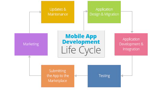
User Interface is incredibly important in an application but so is continued support from the developers of the app. Many applications have some sort of feedback collection method – be it a direct survey on the app itself, an email to the address of the app owner or social media. Developers will be on the lookout for any potential bugs or unintended performance of the application so that they will be quick to work on a fix and release the update to solve any issues users might be having.
Checking out the application page on Android Store or Apple’s own store, one may observe users commenting about issues that were happening. Often you would also see a reply, from the developers of the app, that they are working on the issue. Other cases would show users being even sad that an update did in fact occur, as it might have made the application behave differently than what users would have been accustomed to, which is definitely detrimental in such cases.
Push notifications are another method which adds to the user experience. Food delivery apps for example send out notifications if a particular outlet has a discount on lunch or dinner delivery, which usually brings in larger purchases than normal. Notifications can also take the form of a simple reminder to use the app, as is also customary with food delivery apps. A cheeky reminder to order once in a while is a welcome addition, but frequent pestering of users will affect user experience negatively as they might even uninstall the app to avoid getting these frequent notifications.
User experience is becoming more of a factor in choosing which app to download for what task. There is such a vast choice on the app store that it is becoming so hard to choose which one to download. Making sure your app works as intended and is not complicated is the first step towards slowly gaining a reputation and good reviews.


