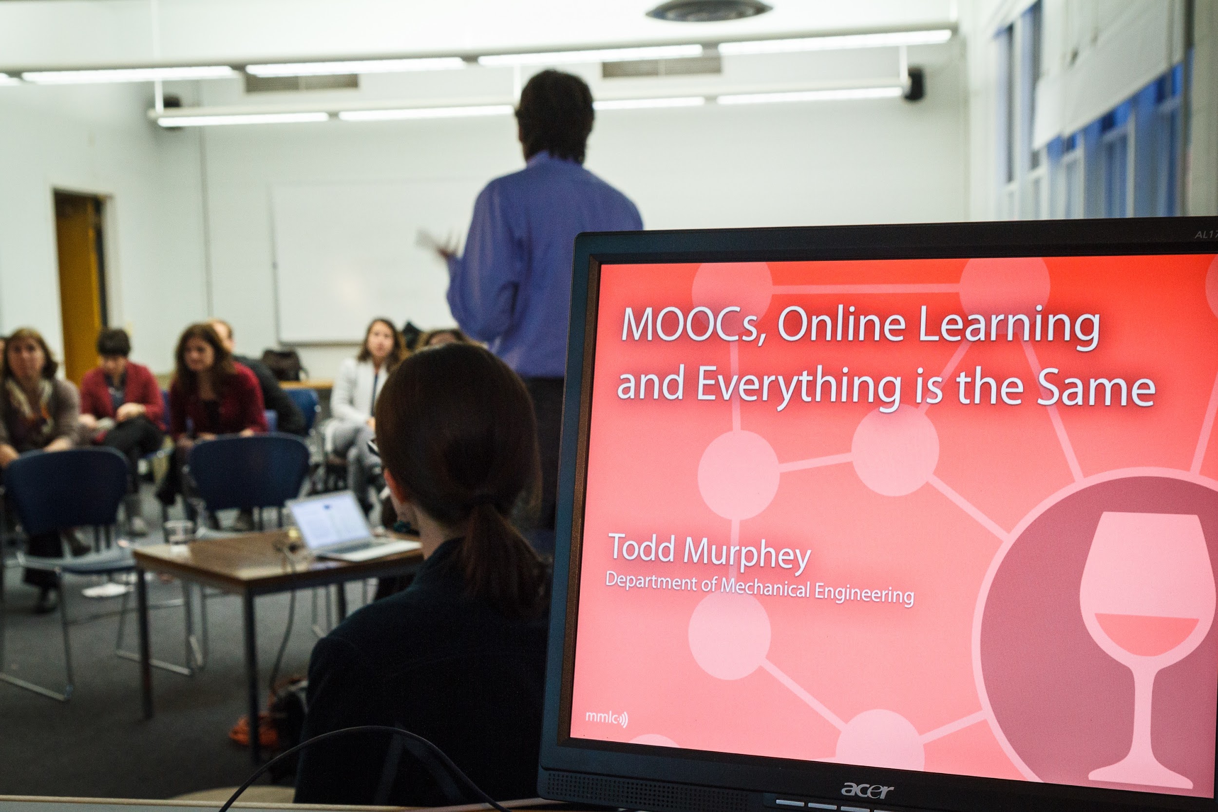
Whether it is for your office or school project, making your PowerPoint presentation look good is key to making a good impression.
Everything from the content to the design has to be thought out and executed well.
If you don’t invest time and effort in creating your presentation, your audience is going to be underwhelmed or misunderstand your message.
Make sure you don’t make the following mistakes.
1. Using Complicated Or Unnecessary Words
Many people end up using complicated words or phrases thinking that it will make their PowerPoint presentation look more professional.
However, they will just make it hard for your audience to understand the main purpose of your presentation.
Long titles, difficult expressions and filler information will distract your audience from the main message. They will spend more time trying to understand what they mean.
Stick to simple words. The information in your slides should be short, concise and to the point.
2. Fancy Animations Or Visualizations
Keep in mind, your PowerPoint presentation isn’t an art or design portfolio.
It may look well-designed or quirky to the artistic eye but it won’t help your audience understand the message.
Unnecessary visual elements in your slides will make them look cluttered and disorganized.
While designing your presentation, make sure each visual element or graphic has a purpose and helps support the message.
Remove elements that don’t contribute anything.
Keep in mind that your audience has less time to read the slides than you do.
3. Using Basic Templates
Complicated designs are a bad choice but basic templates aren’t the best option either.
People who don’t want to spend any time working on their presentation often end up choosing boring, basic PowerPoint templates which everyone has seen and used.
They are more appropriate for school projects, not for professional purposes.
Invest some time in creating your own design or altering some existing designs to make your presentation unique.
You don’t have to go overboard with it, just keep it simple and neat.
If you don’t know how to create or alter designs consider hiring professionals for PowerPoint help. They will create your presentation according to your requirements.
4. Too Many Images
Adding images may seem completely harmless but it can divert your viewer’s attention and distract him from the main content.
Make sure the image you add is intentional and complements your content. Refrain from using too many images as they will crowd the slide.
You should also avoid watermarked images, cropped images and cliparts which don’t add any value.
The image should be scaled properly and positioned appropriately on the slide without cutting off any text.
5. Grammatical Errors
Even if your presentation design is professional, a simple grammatical error can ruin its impression.
Once you finish typing the content, recheck each slide to check if there are any grammatical or spelling errors.
Don’t wait till the last minute to correct them since you might forget to do it altogether.
6. Fancy Fonts & Distracting Backgrounds
The readability of your presentation content is very important.
Fancy fonts can make it difficult for your audience to read the text. So stick to simple ones.
Refrain from choosing patterned or very dark backgrounds which make the text unreadable.
7. Too Many Colors
While designing your presentation, take it easy on your color choices.
Pick two to four colors and design the theme accordingly.
Using too many colors will make your presentation look unprofessional.
Conclusion
A perfect presentation will impress your audience. So don’t hold back from putting your best efforts into making it neat and well-designed.
Start working a few days or weeks in advance so you have ample time to proofread and finalize the presentation.

