Basketball Hoop
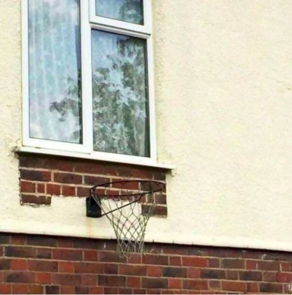
Designing anything is an important job. You have to take a lot of factors into consideration. These designers didn’t fully think through their designs, which can end up in some pretty drastic tragedies. Basketball hoops have a backboard for a reason, to help get the ball into the hoop. Well, this backboard is a window. You definitely don’t want to miss that shot.
Stubbed Toe Waiting to Happen
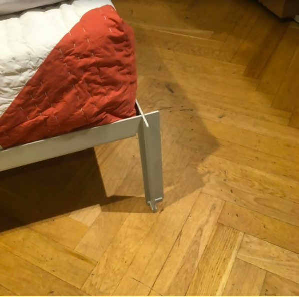
Nobody likes stubbing their toe. One of the most common places people hurt themselves is on the legs of their bedframes. Imagine walking into this in the middle of the night.
Security At Its Finest
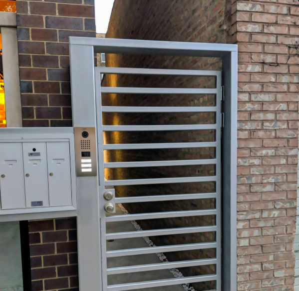
Doors are supposed to be a measure of security and privacy. This door here doesn’t offer either. Who makes a grated door?
Horror Movie Set
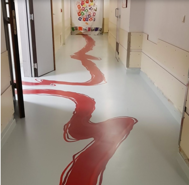
Believe it or not, this hallway is located in a hospital. While the concept is unique, it looks like blood all over the hallway. This belongs on a horror movie set.
Stumbling
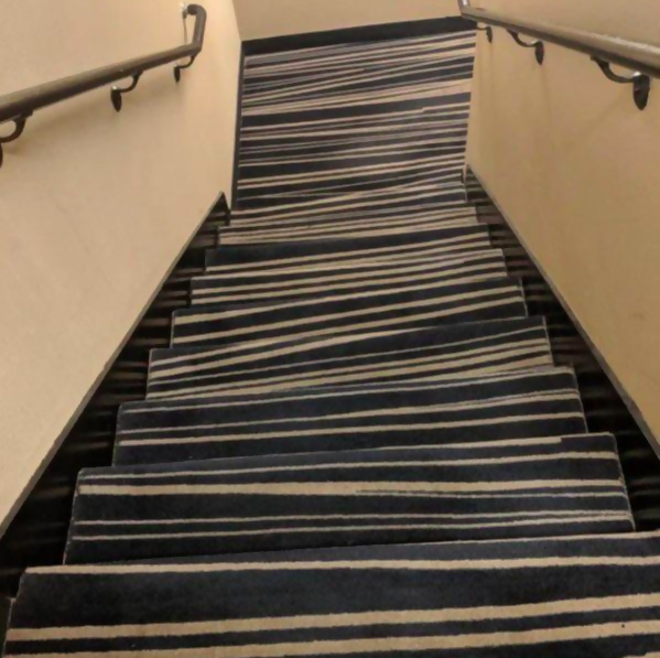
Imagine walking down these steps drunk. Even sober we would get very confused as to where the step ended and the next one began.
Trash Seats
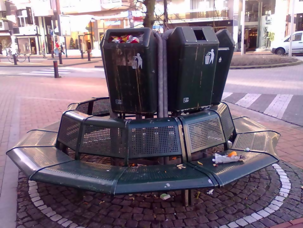
Many people avoid sitting next to trashcans because they’re dirty and smell pretty bad. This bench doesn’t give anyone the option to avoid a stinky trashcan.
Wording is Key
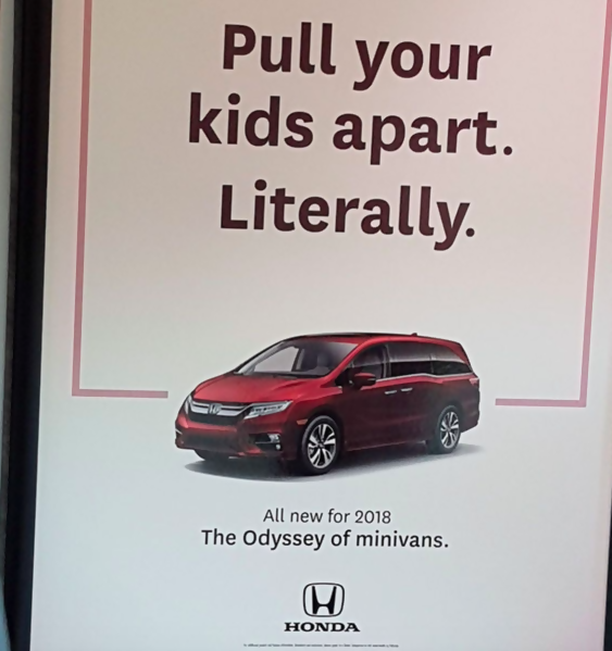
When it comes to creating slogans and taglines for advertisements, it’s important to pick your wording carefully. This copywriter didn’t necessarily think his sentence all the way through.
Missed the Mark

If the fountain was just a tad bit longer or the water pressure was a tad bit weaker, this would be great. Maybe they should put a bucket over there to catch the water.
Wheelchair Slide
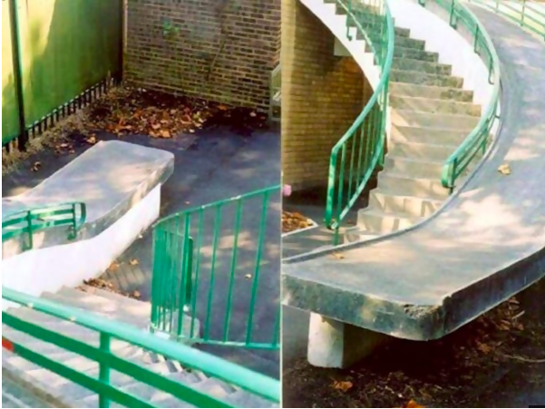
You will often see a ramp next to steps so everyone can get to where they need to go. However, this ramp may cause more harm than benefit if someone went down it in a wheelchair.
Rain Shelter
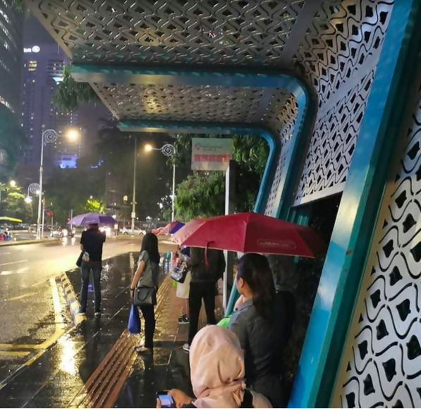
Usually bus stops are designed to shelter you from the sun and any rainy weather. Not this one. Nope, the designer decided to put holes in the roof of it.
Frosted Glass
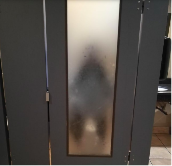
Privacy is a thing of the past. With these frosted glass bathroom stall doors, there is absolutely no more mystery about what goes on behind closed doors.
Dirty Dishes
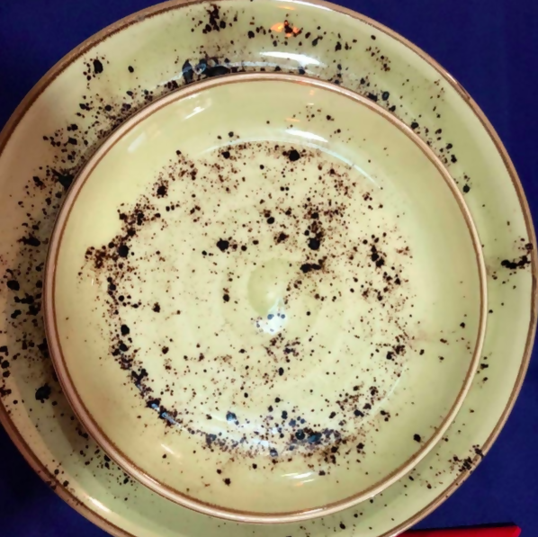
If you really want to drive someone crazy while doing dishes, buy this dish set. They’ll think the dishes are forever dirty thanks to this terrible design. They’ll scrub the sponge raw!
Nope
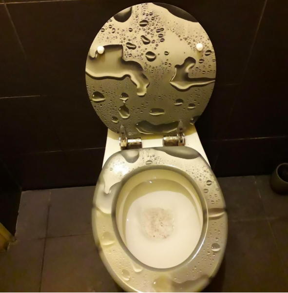
Talk about squatting over a public toilet. While this design is intentional, it doesn’t translate very well.
Balancing Act
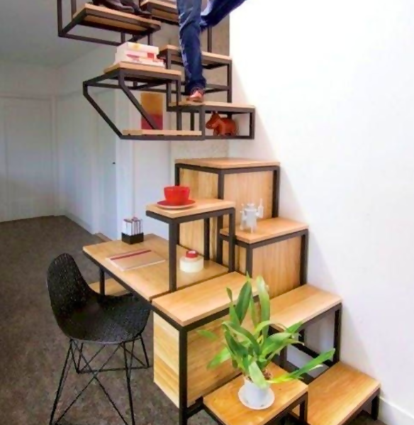
This staircase was not built for the faint of heart. Anyone who doesn’t have great balance should avoid these steps at all cost.
We Don’t Understand
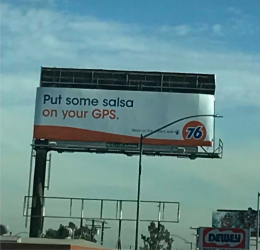
Advertisements are supposed to be emotion evoking and informational. This ad does neither of those things. In fact, we have absolutely no idea what it’s trying to sell.
Creative Minds
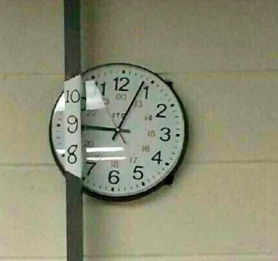
Someone clearly was not thinking when they put up this clock. However, another person came to the rescue by painting the missing numbers on the pole that was blocking them. Now everyone can tell what time it is!
Citrus Fruits
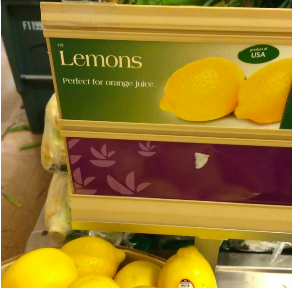
When life gives you lemons, make orange juice? There was definitely a mix up when it came to writing this advertisement.
Best of Both Worlds
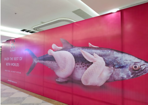
This makes us want to stop eating both meat and fish altogether. Never again should this designer be allowed near Photoshop.
A Poke in the Eye
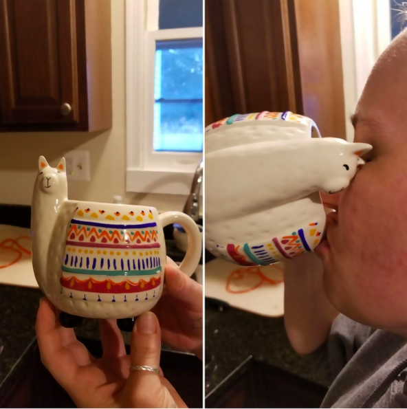
This mug is absolutely adorable! However, every time you take a sip, you end up poking yourself in the eye. Although, it does look like the llama is giving you a kiss on the cheek.
Mouthwatering Soap
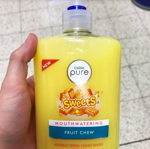
If you’ve ever had your mouth washed out with soap, you know that it doesn’t taste very good. Someone thought “mouthwatering” was a great word to describe the scent of their soap, though.
It’s Impossible

This motivational quote doesn’t do such a good job at motivating people. The message we’re receiving is that everything is impossible and we should all just give up.
Taking a Chance
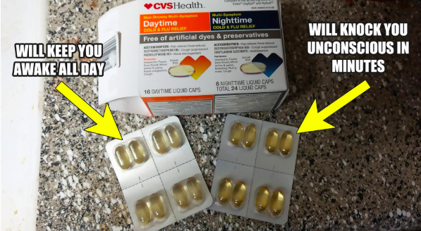
Well this is a daring choice. One will help you stay awake with a cold while the other will put you asleep faster than you can realize you took the wrong pill.
Different Media
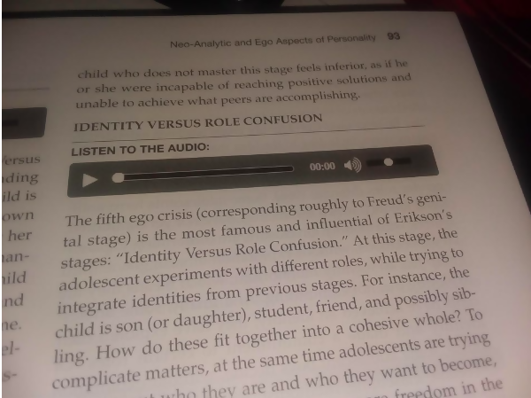
We’re thinking the publishers of this textbook weren’t thinking clearly when they printed this chapter. Unless you are a wizard and can magically make your book start talking, this won’t help many students.
Feed Me

This is a cute idea, but the execution just didn’t cut it. The message is a little contrary here. We want to teach people to recycle so animals don’t eat their trash, but here we have animals asking to eat their trash.
Confused
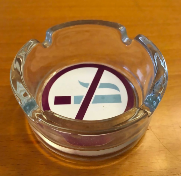
This ash tray is giving us some serious mixed signals. Why would you have an ash tray if smoking is prohibited? Someone please help explain this!
Breast Cancer Awareness
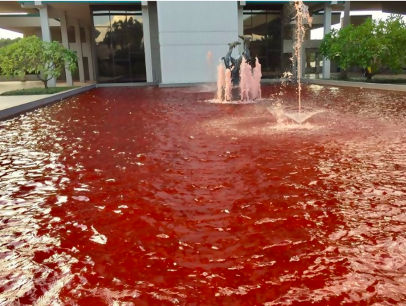
October is Breast Cancer Awareness Month. So, one company decided to show their support and tried to turn their fountain’s water pink. Instead, it came out looking like a pool of blood.
Nickels for Everyone
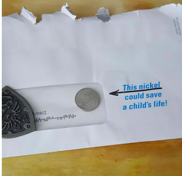
This charity decided to send a nickel out as a marketing campaign. Unfortunately, they didn’t consider that they could just keep all of those nickels and put it towards the charity they claim is saving children.
Giraffe Cinderella
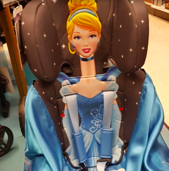
This Cinderella is giving off some seriously unrealistic body image ideas to little girls. Nobody’s neck is actually that long!
No Salting Birds
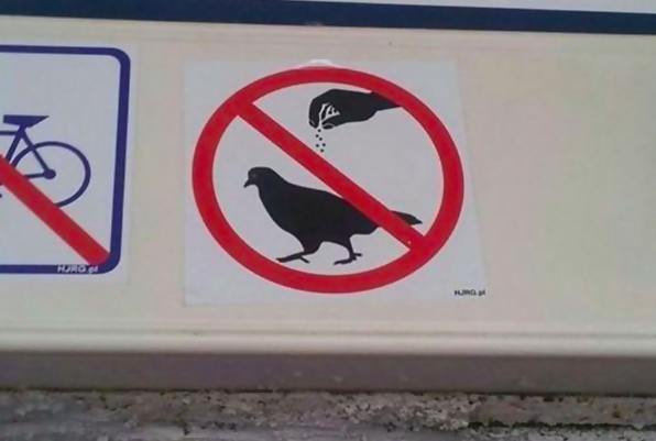
We are assuming this sign was meant to keep people from feeding the birds. However, it looks like it’s telling people not to put salt or seasoning on them.
Disappearing Act
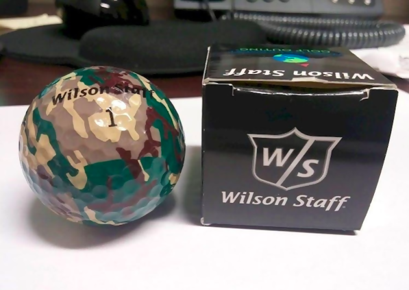
There is a reason that golf balls are white, so you can see them on the course after you hit them. This camouflage ball will be lost after the first swing.
Which One?
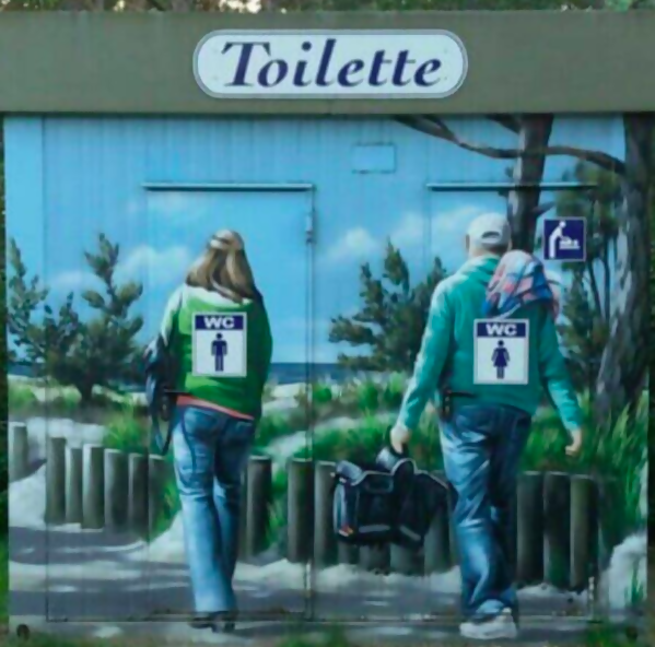
When the artwork shows one thing, but the sign says another thing, what do you do? Can’t we just have gender neutral bathrooms so everyone is on the same page?
Forever Dirty
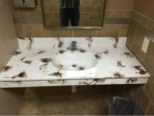
This sink will forever look dirty thanks to this designer’s bad judgment. We can only imagine how many Yelp reviews complain that the bathroom is disgusting at this establishment.
Misdirection
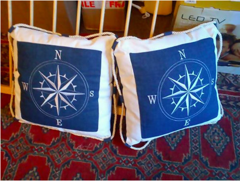
Never Eat Shredded Wheat is how we were all taught the right directions on a compass. Unfortunately, this designer was absent the day that this was taught in school.
Terrible Placement
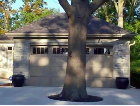
Who’s great idea was it to put a tree in front of a garage, much less right in the driveway? You have to have a pretty small car and be a skilled driver to get in there.
Two Different Causes

It looks like this girl is part of two opposing clubs. One is to stop animal cruelty, but put her hood down and she’s ready to get down with the animal cruelty that takes place.
Donut Holes
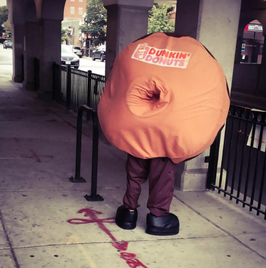
We all love a good donut hole. This wasn’t exactly what we were thinking, though. This poor guy has the unfortunate job of wearing this awful costume.
Winter Is Here
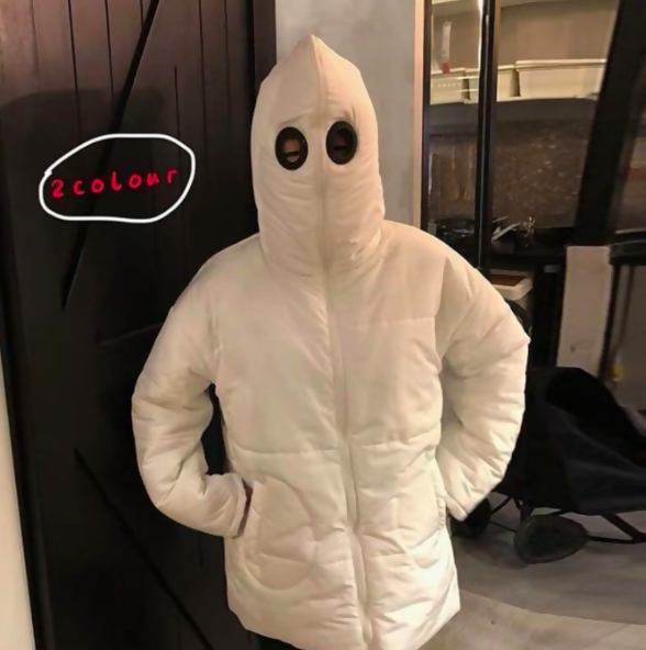
We all know that one person who is cold all the time. While this looks super warm and confortable, it’s just a little too similar to another white hooded outfit we’ve seen before.
Mud Room Shoes

Some people obsess over having clean sneakers. They would go absolutely insane if they saw these. It’s no wonder they’re on sale.
Know Your Fonts
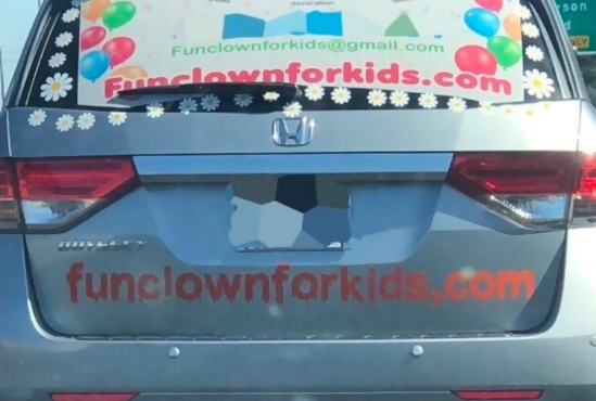
It’s incredible how much a font choice can change your opinion of an advertisement. While the window ad looks great, the URL spelled out in red letters that are dripping makes it look like IT is out to get your kids.
Is There a Pulse?
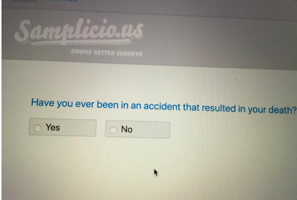
There has to be a way to rephrase this question. What are they wondering exactly? If you’re dead or not?


