
Fashion has always been an interpretive and risky art form. While clothes should be practical, some designers choose to add some flair to them. However, not all of these ideas and designs work out. These are some of the funniest fashion fails to date.
Spell Check
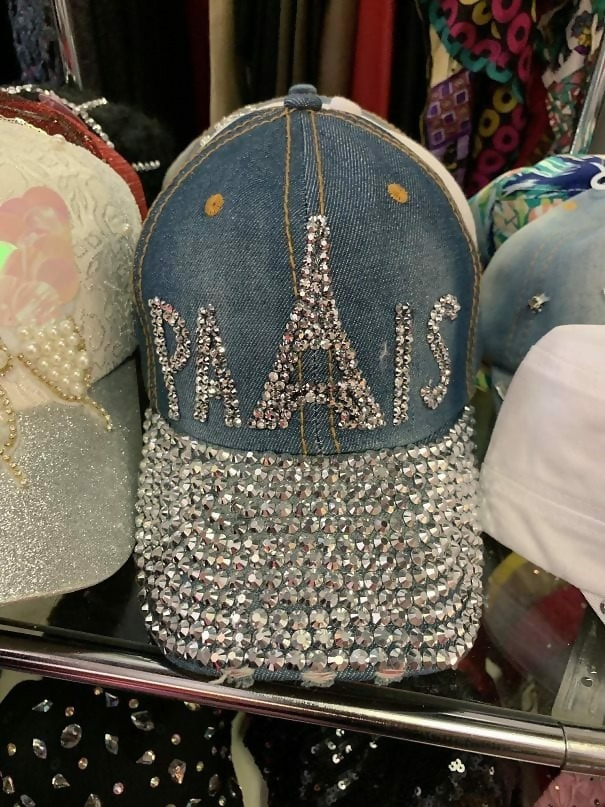
We see what they were trying to do here, but it just isn’t working. It probably wouldn’t have been smarter to use the Eiffel Tower as the “A” instead of the “R.”
Poor Placement
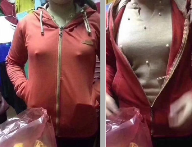
Some designers just don’t think about their designs in a practical sense. Let’s talk about the placement of these pearls for a second.
Missing the Point
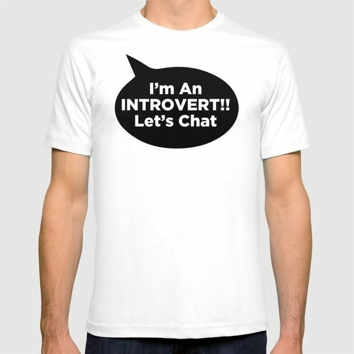
Introverts are known for being shy and not wanting to talk to strangers. So, this shirt is an introvert’s worst nightmare. Never would an introvert invite strangers to talk to them.
Fake Pocket
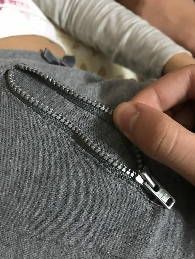
Zippers are added to clothes for a reason. Usually it’s to close a jacket or pocket. So, why would someone put a zipper just for the sake of having a zipper?
Disney Wouldn’t Approve
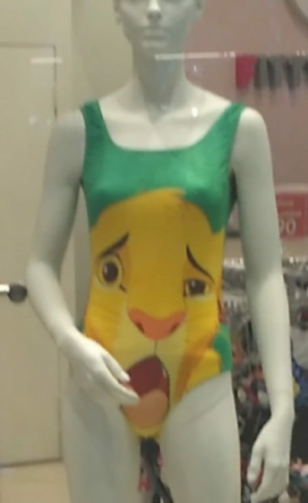
Placement is everything when it comes to printing characters on an item of clothing. Maybe if Simba didn’t have his mouth open this would have been a better bathing suit.
Support Local Businesses
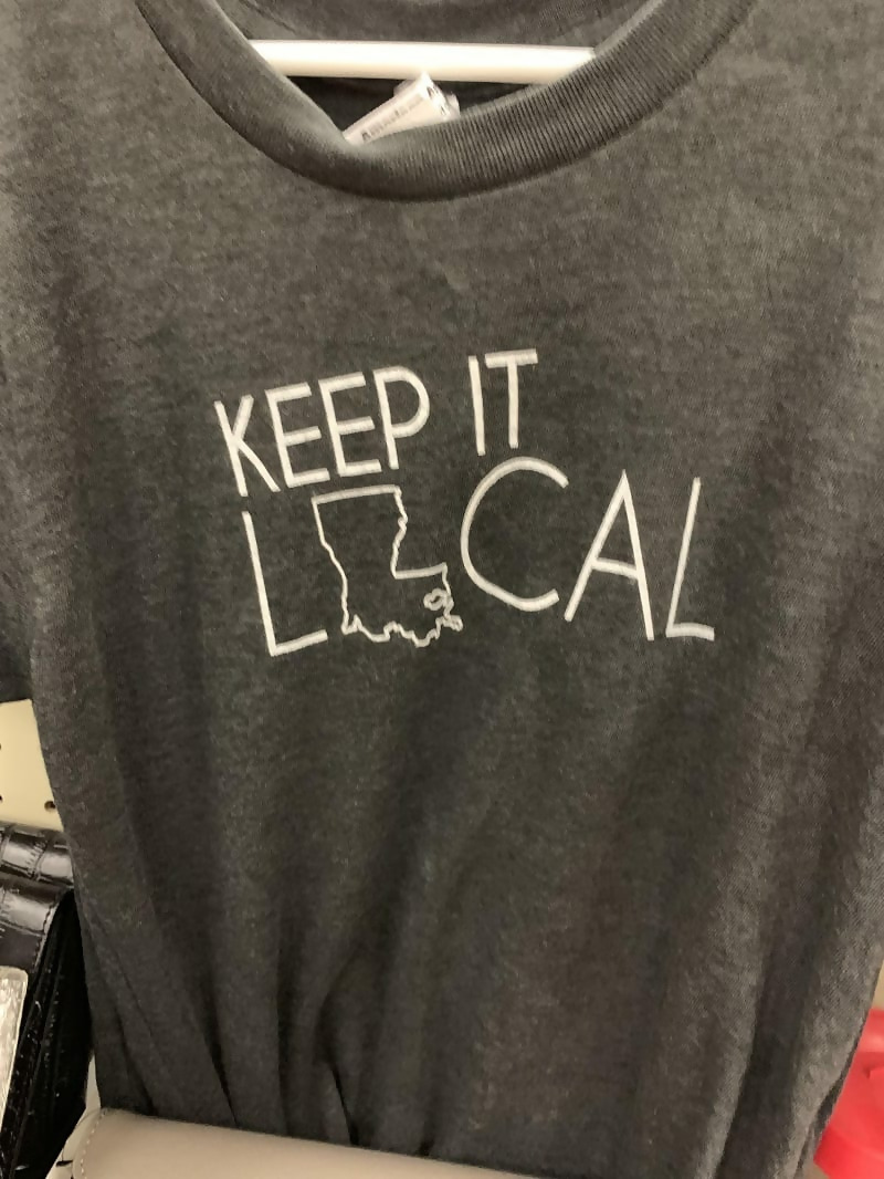
This design wasn’t full thought through. Wouldn’t it have made more sense if the state was used as the “L” instead?
Can’t Help But Wonder

We can’t help but wonder what this designer was thinking when he created this skirt. It will definitely keep people wondering if it’s part of the design or not.
Nope
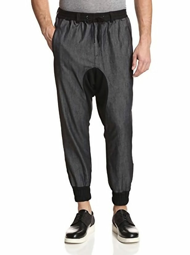
Who would think that placing black fabric in the groin area is a good idea? All it does is draw attention to it.
What Big Ears You Have
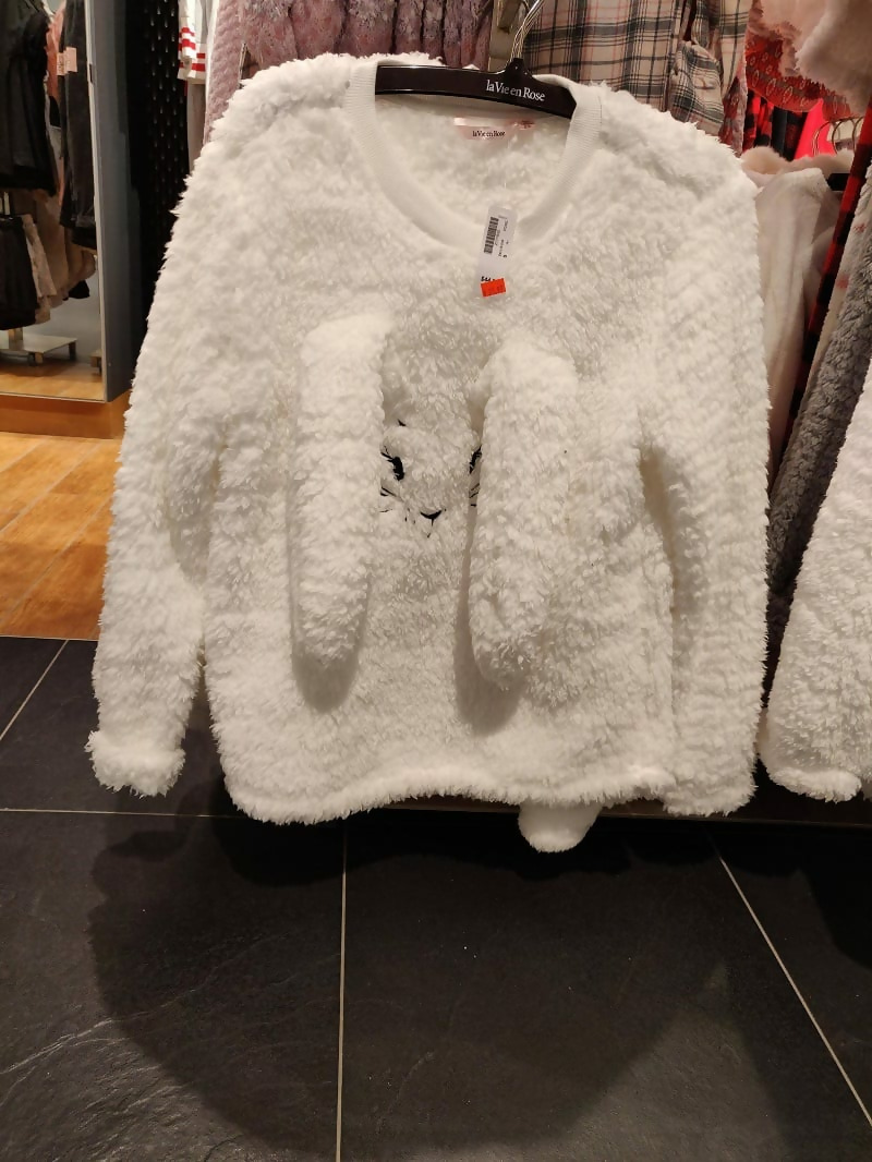
Is it really necessary to have things coming out of a shirt? No, but this designer definitely felt that it was.
Not How You Read
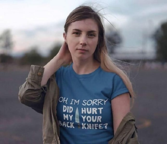
When we learned how to read, we learned that words go from left to right. So, why would this designer make you read in columns? It just gets confusing.
Double Take
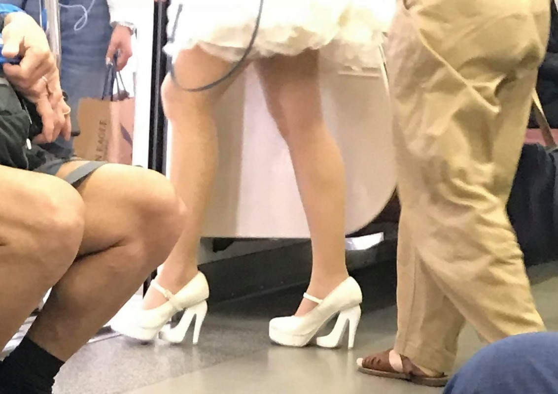
These shoes made us do a quick double take. They’re very clever, but are they practical? We just give this woman props for being able to walk in them.
Animal Confusion
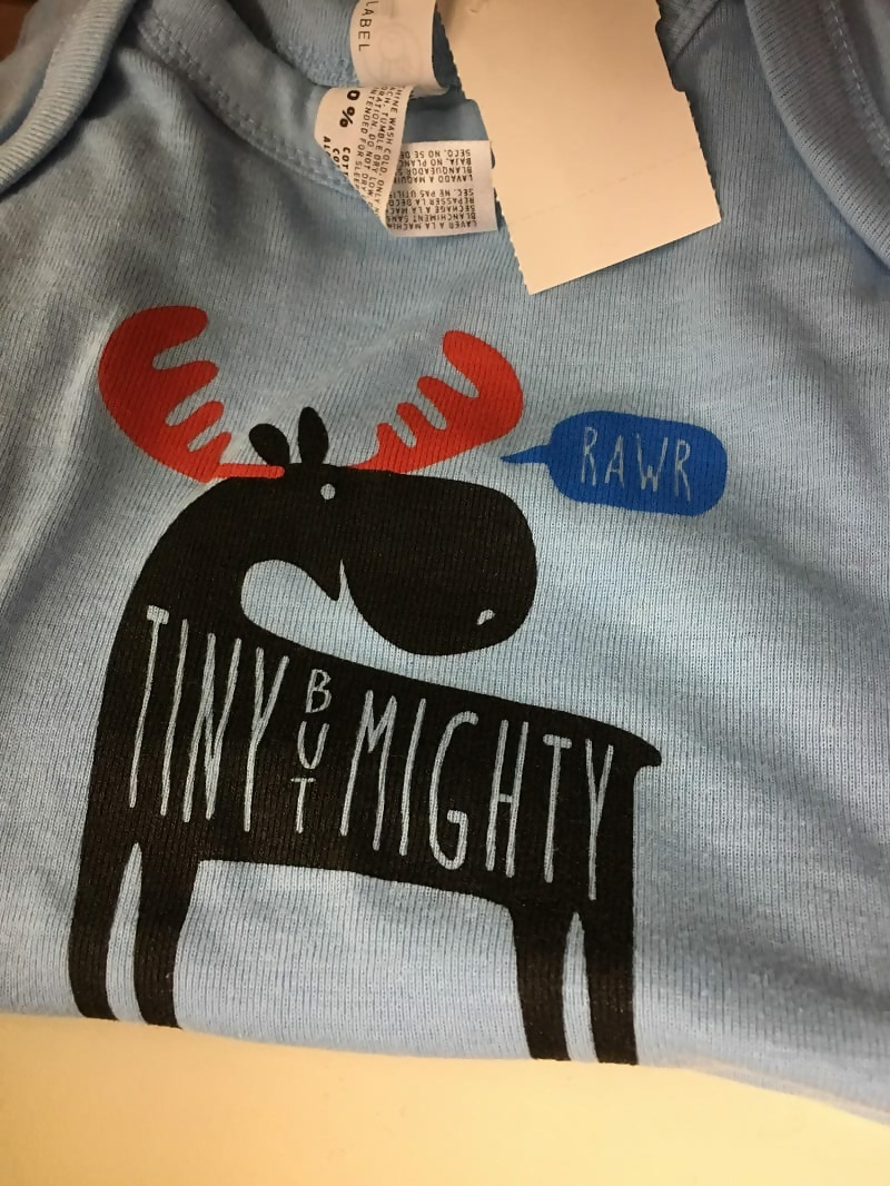
This animal is just a little confused. We’re pretty sure moose don’t “rawr.” Was he mean to be a dinosaur, maybe?
Girl Power
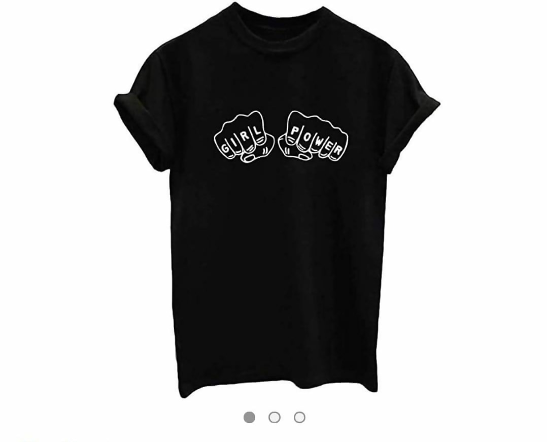
It’s always empowering to see women supporting other women. However, let’s think about the placement of these two fists when the shirt is on someone’s body.
False Advertising
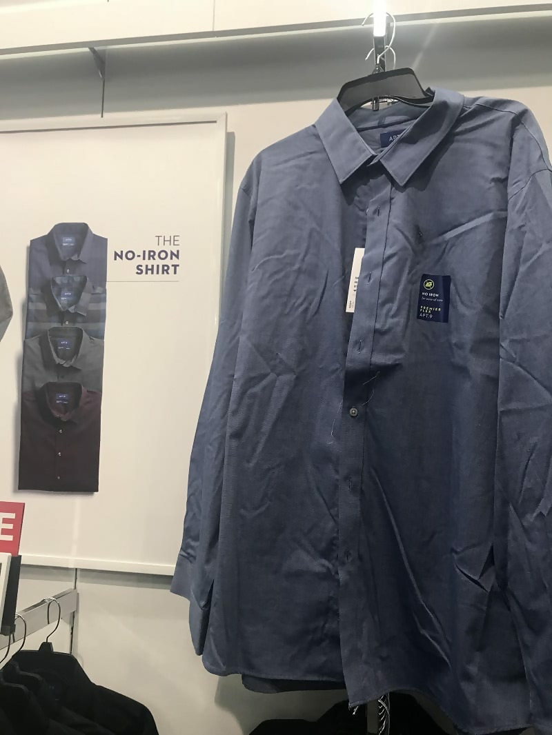
This “no-iron” shirt is clearly not fooling anyone. It’s probably smarter not to put out wrinkled shirts on the floor if you’re looking to make a sale.
Tread Lightly
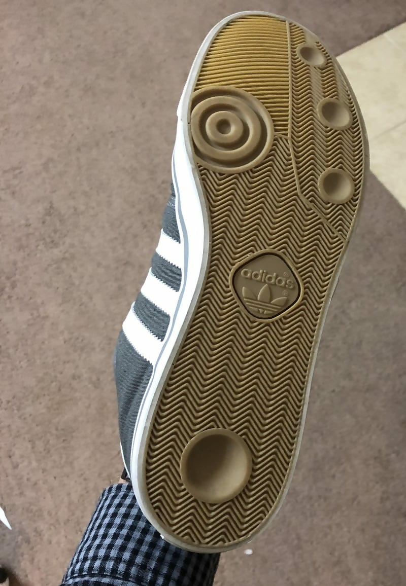
Even Adidas has a design mishap every now and then. Why are the bottoms of these shoes partly concave? What does that do for the traction anyway?
Mixed Messages

This woman is clearly supportive of animal rights and keeping them safe. However, she sends a mixed message once she puts her hood down.
Wait, What?
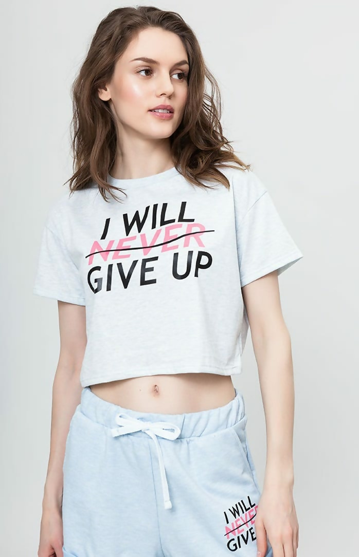
This would have been a great motivational workout outfit if the designer hadn’t put that line through “never.” We get it’s supposed to look trendy or whatever, but use your common sense people!
Strike Through
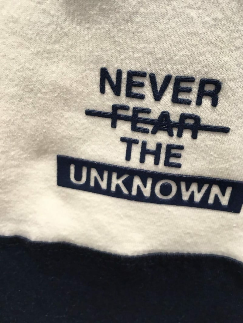
It seems like some designers don’t understand the concept of the strikethrough. While it looks cool, it’s meant to cancel out a word. So, this would read “Never the unknown,” which makes absolutely no sense.
Meat Tacos

This could be read two different ways. Either the person wearing the shirt is telling someone else that they had meat tacos or they are saying in a loving way that the person had them at “tacos.” You can decide which way to take it.
Off Limits
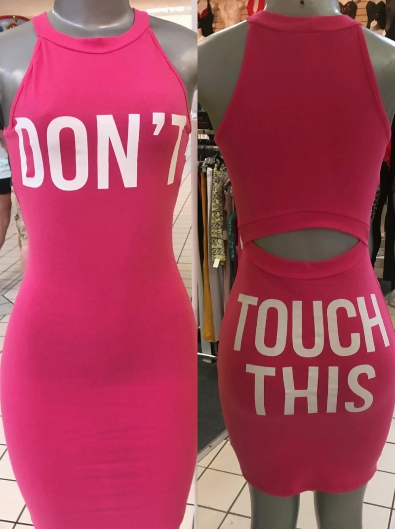
At first this seems like a pretty decent dress, until you see what’s written on the back of it. It seems to be giving some mixed messages here, especially if you are only looking at the back. Women, beware of going out in public in this dress.
Logos Ruin Everything
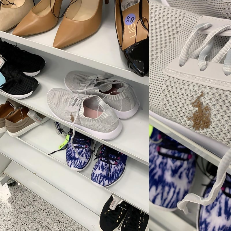
Sometimes you see an item of clothing or shoes and you really fall in love with it. That is, until you notice the hideous logo plastered on it. That’s exactly what happened with these shoes. Whoever thought it was a good idea to put a brown logo on white sneakers should be fired.
Inspirational Quotes
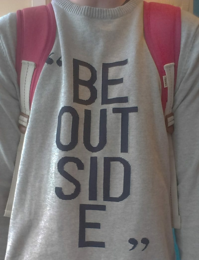
Why do designers feel that it is necessary to separate words on clothing? Not only does it make it much harder to read, but it just doesn’t look good at all!
Specific Audience

This shirt is for a specific group of people and that group of people is swimmers. It’s a great quote, really! However, if you are not on the swim team, you may feel a little confused.
Always Look at the Back
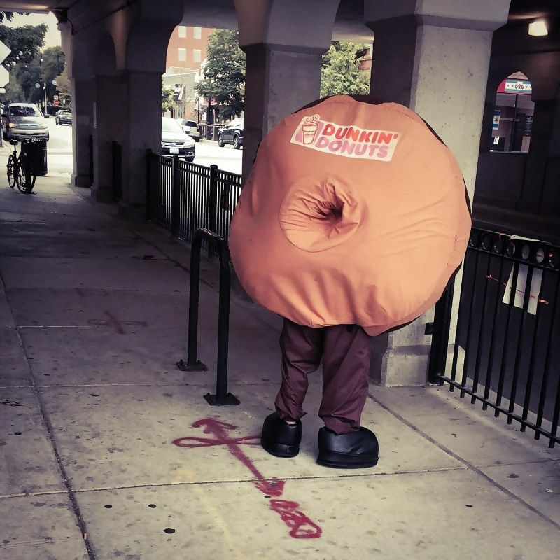
This poor mascot had the unfortunate luck of wearing this poorly thought-out costume. Who would put the hole of a donut in the back of the outfit? They’re just asking for trouble.
Two for One Deal
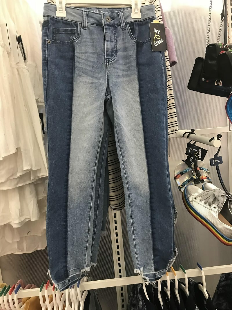
These pants look like they are two different pairs sewn together. The brand is Art Class, which makes sense because these definitely look like someone’s art project.
It’s Supposed to Be Like This
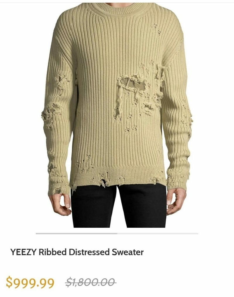
Only Kanye West would come up with a sweater that is torn up and looks like it should be thrown out and sell it for a thousand dollars. You have to be certifiably crazy to spend money on this “distressed sweater.”
Fact Check
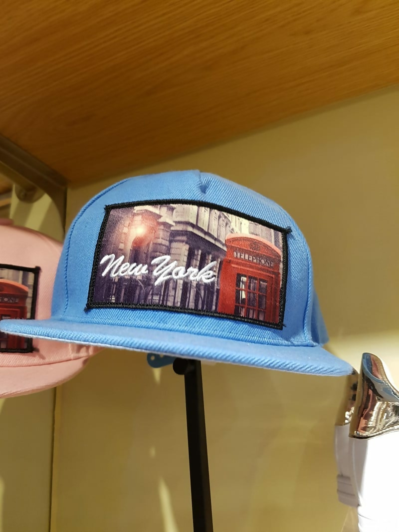
Before printing an image on hundreds of pieces of clothing, you should double check that it’s accurate. This hat that says “New York” is sporting a very familiar picture of London.
Take Your Time
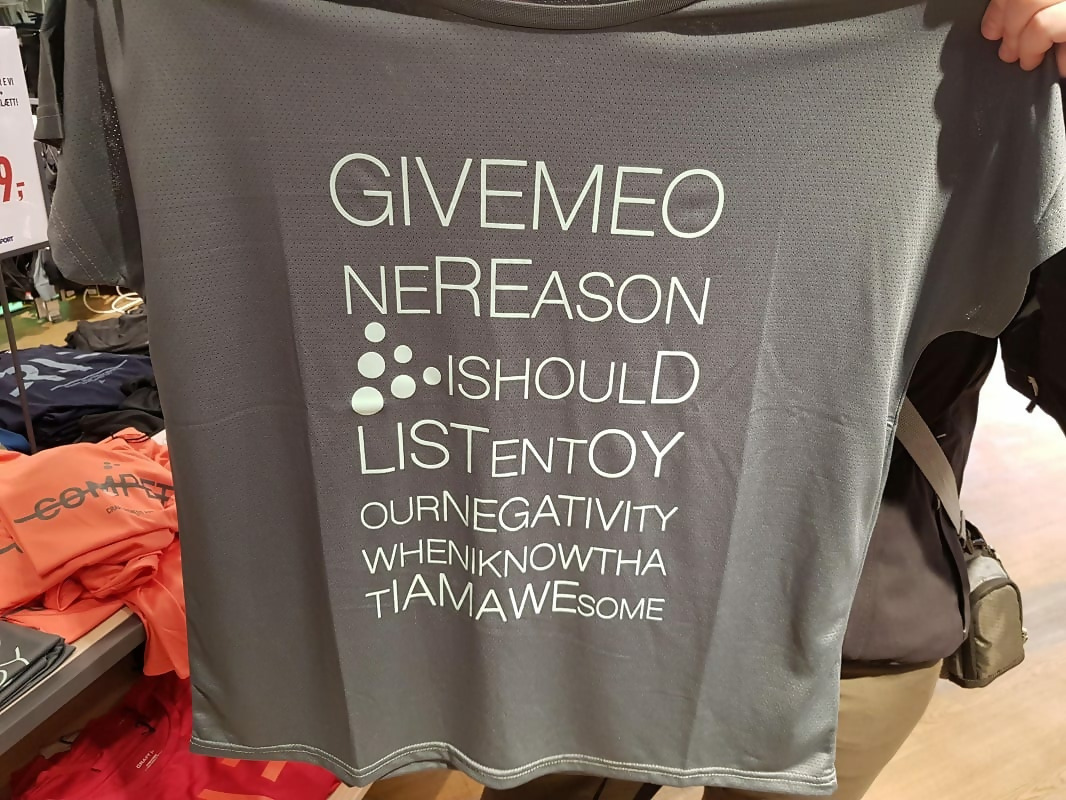
How long did it take you to read this shirt and fully understand it? It took us much longer than we’d like to admit. Once again, designers feel the need to break up words for no reason.
No Words
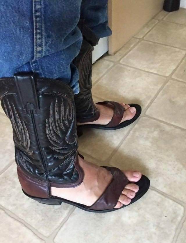
Who let this design come to life? We understand that your feet get hot and sweaty in boots during the summer, but this is a crime against fashion. Burn them all!
The Permanent Stain
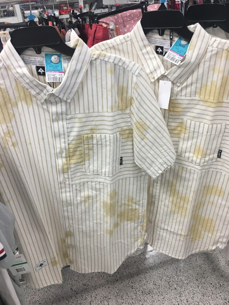
There is no amount of stain remover that will get these “stains” out of the shirts. At first, you may think someone accidentally spilled their soda on the shirt and never said anything. That is, until you look at the shirt behind it and see that it’s exactly the same!
I Play the Accordion
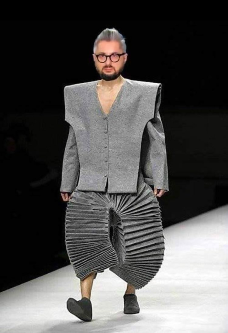
You know how some people start to look like their dogs after a while? Well, if you play an instrument for a long time, you can start to look like it as well. This man clearly has a passion for the accordion.
Be You. Be a Viking.
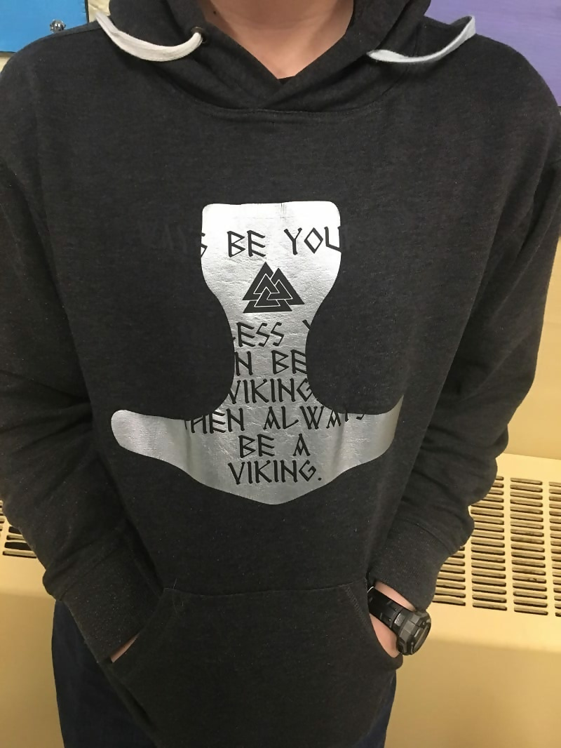
This shirt may have made more sense if the words weren’t invisible. Follow the color wheel, people! It’s like lesson one in art school.
Fancy Crocs
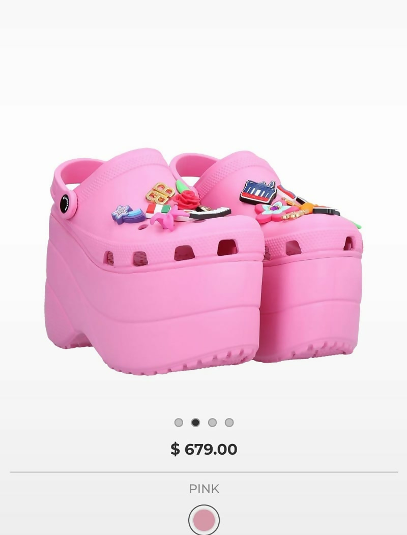
While Crocs have a pretty bad reputation, these take the cake for being the ugliest shoes. We don’t care how comfortable they are, please don’t spend that much money on them. We are begging you!
Bruised
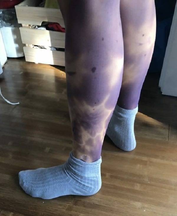
The idea was well intentioned, but not properly thought out. We get it’s supposed to be tie-dyed, but it comes off as if the girl isn’t wearing any leggings and her legs are extremely bruised. Try again!
Wrapped Up Tight
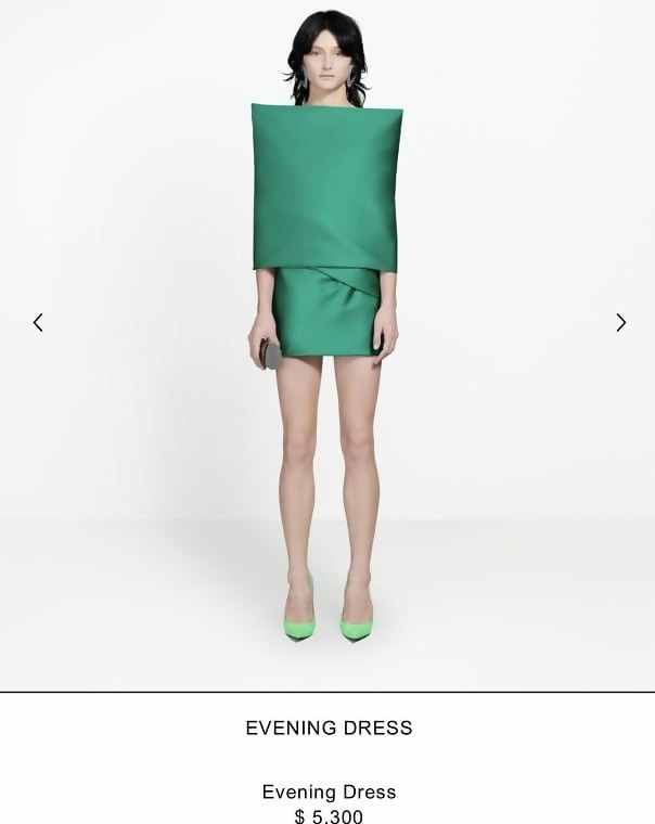
This $5,300 evening dress will put a smile on your face when you wear it to your next event. Or maybe not because you won’t be able to move your arms, or sit down in the car, or be happy in general.

